2013 USC Passing Heat Map

Now that we have broken down the running game with last week’s post, this post is going to take a look at the passing game.  We will look at the passing game by analyzing the Passing Heat Map (I will admit that I stole the idea of this post when I was reading this great article posted on Grantland).  A heat map is a visual representation of data that we gather and can be very useful for finding the “hot spots.”  In our case, I gathered and plotted passing information from the 2013 football season and we will swap around different data sets to see what we can find.

Completed Passes

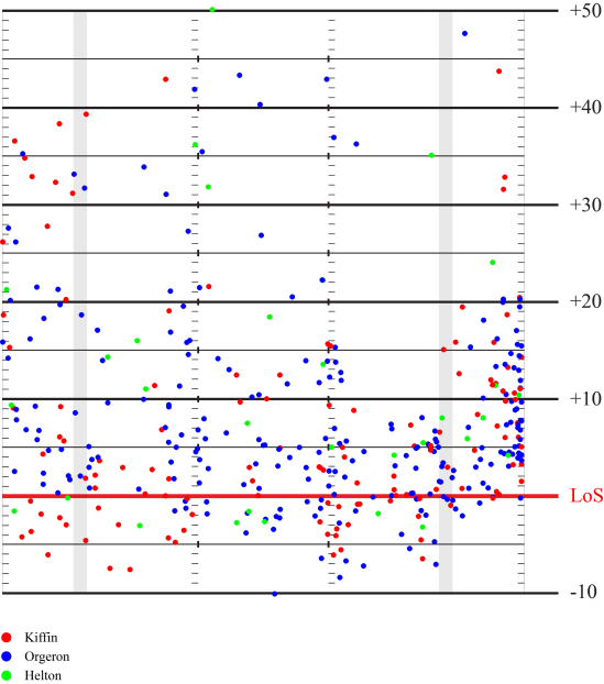
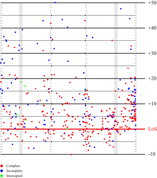
First, let’s look at the most obvious Passing Heat Map: passes complete vs incomplete vs intercepted.  The diagram below represents all 392 passes that I tracked last season (not nearly as much data as the 19,000 passes tracked in the Grantland article…and my tracking isn’t nearly as precise/accurate as ESPN’s Stats and Information Group).  Each dot represents one pass: red is a completed pass, blue incomplete, and green intercepted.  The red line at near the bottom represents the line of scrimmage with the yard markers showing the distance relative to the line of scrimmage.  The dot represents the position that the throw was to, so it does not account for yards after catch or anything of that sort.  The two grey vertical bands on the left and right serve as markers to where the numbers on the field are.  You can click on any of the diagrams to view a larger version.

2013_HeatMap_Completions

As can be seen here, the majority of passes are short throws.  68.8% of passes are thrown within 10 yards of the line of scrimmage.  Only 11.5% of passes are deeper than 20 yards.  These numbers fall in line with what Grantland found in the NFL.

USC also favored the right side of the field when passing.  47.6% of passes are outside the right hash mark while 29.9% of passes are outside the left hash mark.  The remaining 22.5% of passes were between the hashes.

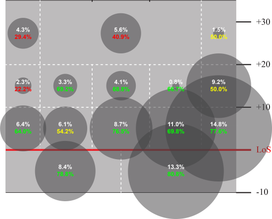
Here is the field broken down into different passing zones.  The white percentages represents the percentage of passes thrown to that zone.  This is also represented by the size of the circle.  The colored percentages represent the completion percentages for that zone..

2013_HeatMap_PassingZones


It is first very apparent the favored are of attack being the short right passes.  Quick outs, hitches, flats, and swing passes dominate the right side in last year’s offense.

The completion rate is highest nearest the line of scrimmage and diminishes as passes get further from center.  Because of the diminishing completion rate (and also probably a factor of OLine protection as well), there have been few deep attempts.  There is also oddly a surprising lack of attempts made towards the intermediate passing zones on the left side of the field.

Completion percentages were highest between the hashes with a 70.5% completion rate.  The right side of the field had a higher completion rate (68.8%) than the left side (57.3%).

Breakdown by Coach

Let’s look at the breakdown by head coach.  It is worthwhile to note that Coach Helton only had one game as head coach.  He was also was Offensive Coordinator during Coach Orgeron’s run, so he had a hand in the play calling there as well.

2013_HeatMap_Coaches

Coach Kiffin had the highest percentage of passes that went behind the line of scrimmage (29.7% for Kiffin, 25.8% for Helton, and 18.9% for Orgeron).  Both Kiffin and Orgeron had about 70% of their passes within 10 yards (Helton was 54.8%, but that may have just been the specific game plan against Fresno St).  For deep passes beyond 20 yards, Helton had the highest percentage with 22.6% (again, possibly the specific gameplan), followed by Orgeron was at 13.5%, and Kiffin at 11.7%.

It is also worthwhile to note that Coach Orgeron was much more open to utilizing the area of the field beyond 20 yards and between the numbers (the deep middle) while Coach Kiffin avoided this space.  Even Coach Helton had more attempts (5) in the deep middle than Kiffin (2) with 1/5th the amount of games.

Breakdown by Quarterback

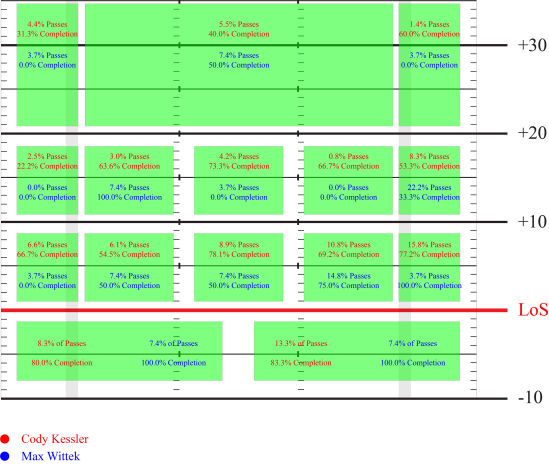
Let’s just do a quick comparison between Kessler and the limited attempts that Wittek had based on zone.  The diagram below will show the percentage of passes that went to each zone as well as the completion percentage.  Kessler’s numbers are in red while Wittek’s numbers are in blue.

2013_HeatMap_Quarterbacks

Kessler was much more likely to throw the short routes (69.8% of passes within 10 yards compared to 51.9% for Wittek).  Wittek was slightly more likely to throw the deep ball (14.8% of Wittek’s throws beyond 20 yards compared to 11.4% of Kessler’s).  There is a combination of things going on with that aspect though.  Wittek was mostly put in for end game situations, so it was unlikely for him to have to throw the deep ball or else the divide may have been greater.  Wittek is known for his arm though, especially compared to Kessler.  Kessler actually had a greater completion percentage on the deeper balls (33% completion rate for Kessler compared to 20% for Wittek).  This may have to also do with the 2nd string receivers possibly playing for Wittek.

 Breakdown by Receiver

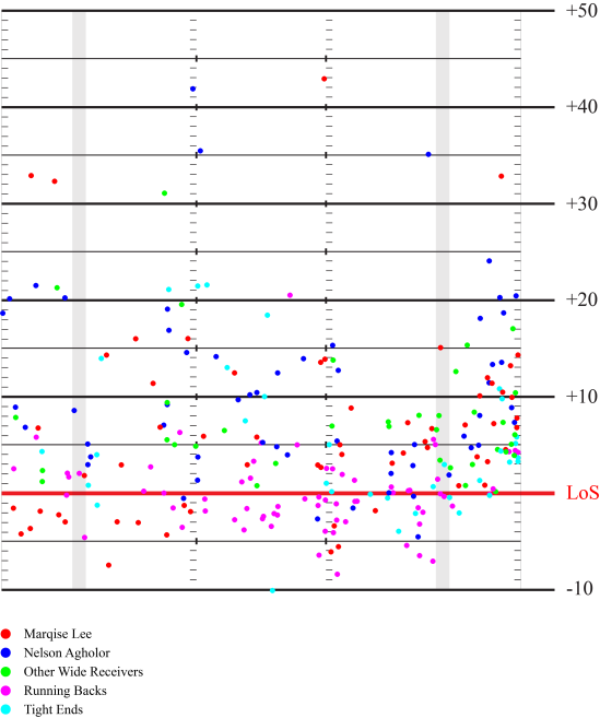
Now let us look at the receiving end of the passes.  I tracked the receiver on completed passes only, so these are receptions rather than intended receivers.  I have grouped it generally by position to prevent the diagram from being too cluttered.  I have left Marqise Lee and Nelson Agholor separate as they were the primary targets of our passing game.  By concentrating on particular colored dots, you can faintly see the passing trees and primary routes emerge.

2013_HeatMap_Receivers

Looking at Marqise Lee’s red dots, you can see the groupings of routes that he has caught.  On the left side are a number of bubble screens caught behind the line of scrimmage.  Not nearly as many bubble screens to the right, possibly indicating that Lee more often lined up on the left unless he was in the slot.  In the short to intermediate depths, on the left side moving towards the middle, you can see the slant, post, and drag routes.  On the right side near the sidelines, you can see the out routes and hitches.

Now let us look at Nelson Agholor’s blue dots.  There are some hints of bubble screens and jailbreak screens on the right side of center.  For the short passes, to the middle of the field are a number of drag routes and slants.  On the outside, Agholor utilized the sidelines quire effectively.

Looking at the running backs’ pink dots shows a couple routes that are to be expected from that position.  Behind the line of scrimmage are a number of screen passes found near or between the hash marks.  Behind the line of scrimmage to the right are check down swing passes and ahead of the line of scrimmage are check down passes to the flats.

The Tight End routes in cyan are fairly expected as well.  Mostly passes to the flats and short middle routes which are likely hitches.  The deeper passes that are 10-20 yards down the field are seam routes where the TE sneaks behind the linebackers as a downfield threat.  I believe the random dot 10 yards behind the line of scrimmage was Kessler was just getting rid of the ball due to pressure and just threw the ball at the TE’s feet.

What Down is it?

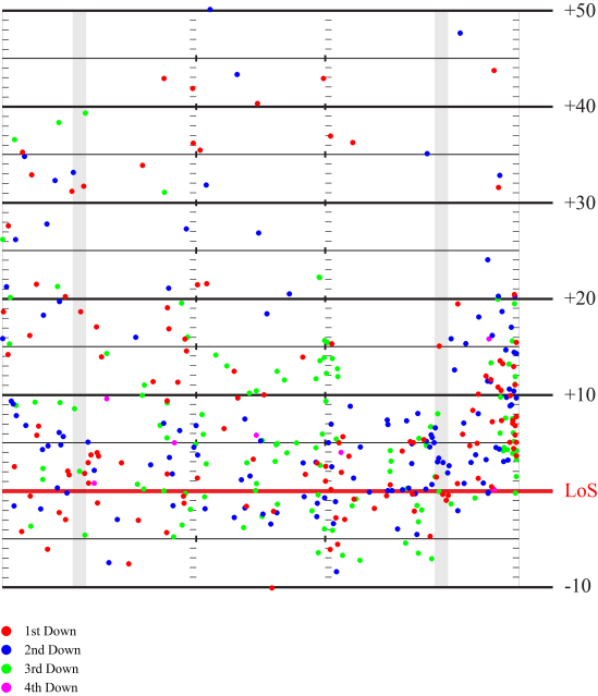
Now let’s take a quick look at the heat map based on the down.

2013_HeatMap_Down

Not too surprisingly, most of the downfield passes were made on 1st or second downs.  These downs also had a decent amount of short passes, typically to help make 3rd downs very manageable.  3rd downs are particularly interesting as they tend to stay within about 15 yards, so most likely the pass is made to the distance needed to convert.  There are a couple down field passes on 3rd down and those are generally up the left sidelines.

What about Play Action?

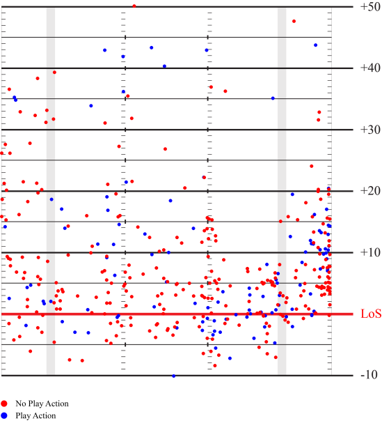
Now let us take a couple of quick looks at diagrams based on various strategies and situations.  Here is the passing heat map for when USC utilized play action or not.

2013_HeatMap_PlayAction

Most people think of play action as opportunities to take the deep pass.  However, a lot of the benefits for play action come in the intermediate distances and in the flats as it freezes the linebackers.  Many of the play action passes are grouped short and to the right.  A good portion of these passes are probably a TE or FB leaking out from the backfield and getting open in the flats.

Overall, the percentage of short passes decreased with play action, but they were still the majority of passes.  61.9% of play action passes were within 10 yards of the line of scrimmage (compared to 71.3% without play action).  25.7% of play action passes went between 10 and 20 yards, which is a decent increase from the 17.5% of non-play action passes in this area.  Deep passes were fairly similar with 12.4% of play action passes and 11.3% of non-play action passes going beyond 20 yards.

Play action passes were also more likely to go to the right side of the field, with 56.6% of play action passes outside of the right hash (compared to 43.6% of non-play action passes).  This isn’t too surprising since our QBs are both right handed, so a rollout to the right is easier to execute.

How Does Formation Change Things?

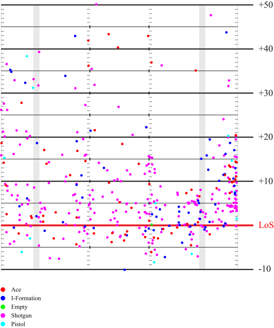
I broke it down by five offensive formations: Ace, I-Formation, Empty, Shotgun, and Pistol.  Shotgun and Pistol are based on the Quarterback’s alignment.  In both these formations, the Quarterback is back from the line of scrimmage with a potential running back next to him (Shotgun) or behind him (Pistol).  If the Quarterback is under center (at the line of scrimmage), Ace is a formation with a single running back, I-formation is with two running backs, and Empty is no running backs.  Now let’s look at how passes are made based on these formations.

2013_HeatMap_Offensive_Formation

On first glance, the majority of passes came out of the Shotgun formation, since the heat map is riddled with pink.  This is in fact quite true.  62.1% of all of USC’s passes came out of the Shotgun.  This both surprising and not given that USC spent about an equal amount of time in Shotgun, Ace, and I-Formation.  This is because while in Shotgun, USC passed the ball 86.7% of the time (compared to 25% of the time for both Ace and I-Formation).  Not too surprising since Shotgun is a pass heavy formation.

One interesting aspect of I-Formation is it seems to have a lot of passes to the right within 10 yards of the line of scrimmage.  If you’ll reference back to the play action diagram, they share a striking similarity in that zone.  I venture to guess that this is due to the I-Formation being a perfect formation to run play action out of, since it is typically a run-heavy formation.  Simply do play action then dump the ball off to a TE or the FB in the flats.  This has been a strong play for USC all the way back through the Carroll era.

The Defensive Formation

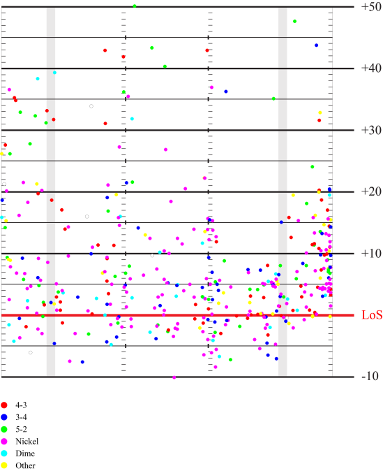
Now to analyze how USC’s passing attack was dictated by the opposing defense.  We’ll start by looking at the defensive front and work our way into the secondary.  The defensive front is the alignment of the defensive players within the box.  These players dictate how the run is defended and can give a clue into how the defense will react in general.  The major formations that we faced were the 4-3, 3-4, 5-2, nickel, and dime.  For the purposes of this article, the 4-3, 3-4, and 5-2 are similar in that they all have seven defenders in the box.  The nickel removes one player, leaving six in the box while the dime removes two players and leaves five in the box.  These players outside of the box are now better suited for pass defense.

2013_HeatMap_Defensive_Front

One interesting thing that I note from this heat map is against the 3-4 defense.  There is a distinct lack of deep throws against the 3-4 when you compare it against the 4-3 and 5-2 defenses.  I am unsure about why this is and if there is an overall strategic reason for this, if it was dictated by the teams that we happened to play against that utilized a 3-4, or if it was just an anomaly.

Unsurprisingly, against the Nickel and Dime packages, our passes tended to stay closer to the line of scrimmage.  Those extra defensive backs seemed to do their jobs well preventing deeper passes.  Against the Nickel, there is a somewhat noticeable uptick in intermediate passes between the hashes, likely due to the lessened number of linebackers becoming spread thinner.

Watch the Corners

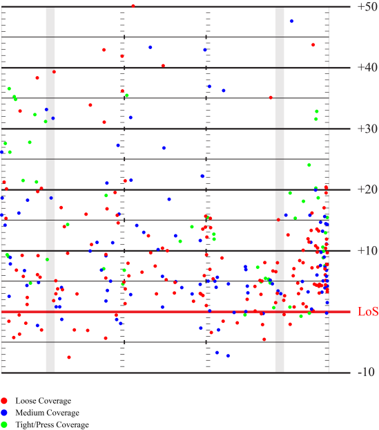
Moving further into the secondary, we have the cornerback alignment.  The way I tracked this was based on the alignment relative to the intended receiver.  I classified loose coverage was when the defender was seven or more yards off from the receiver at the snap of the ball.  Tight or press coverage was when the defender was within three yards of the receiver.  Passes to the running backs are omitted here as the secondary alignment doesn’t hold as much meaning in this context.

2013_HeatMap_Secondary_Alignment

A good amount of the passes behind the line of scrimmage (bubble screens etc) were against loose or medium coverage.  This isn’t too surprising as this allows the best opportunity for your other players to get into their blocks and also gives the receiver space to make his moves.

There are also a number of deep passes against loose coverage.  On first thought, you might think that the purpose of loose coverage is to defend against the deep ball, which would imply that fewer deep passes would go to that depth.  However, the loose coverage itself might imply that the corner knows there is no over-the-top help by a safety, which is why he is playing loosely.  This could lead to some opportunities in the deep pass.

Against tight coverage, there is a good deal of passing to the sidelines.  Most of these are probably just streaks right up the sidelines, creating a footrace between the receiver and the defender in tight coverage.  The patterns crossing the middle also appear to take the shape of slant routes.  This combination is interesting as it could imply utilizing both the slant and the sluggo (slant-and-go) up the sideline against tight coverage, forcing the defender to make quick turns on his hips to try to keep up.

Where’s the Safety?

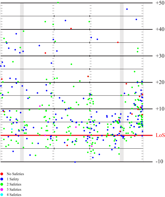
Moving even further back is the safety alignment.  One of the QB’s pre-snap (and post-snap) reads is determining if the safeties are “even” or “odd.”  This means counting how much deep safety support there is on the field.  It is typical to face either one or two high safeties.  However, occasionally a defense will crash all the safeties down near the box in run support or to blitz.  It is also possible to see them drop three or even four guys high up top in more of a prevent defense look.   I tracked the number of high safeties at the snap of the ball and charted them here.

2013_HeatMap_High_Safeties

Against one safety, there is more of a tendency towards the sidelines as you move further away from the line of scrimmage.  This is usually because the safety is roaming the deep middle.  Compare that against two high safeties and there is more of a cluttering in the intermediate middle of the field.  This is because in a single high safety look, there can often be a defender roaming the intermediate middle zone under the high safety.

Man vs Zone

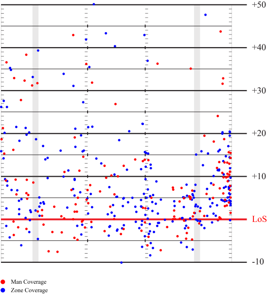
Here is a breakdown of the passes made depending on man or zone coverage by the defense.

2013_HeatMap_Man_vs_Zone

Man coverage does appear to take the majority on a couple areas of the field including the deep right sideline and the area behind the line of scrimmage on the left.  Zone coverage has other areas such as the intermediate part of the field outside the left hash as well as the middle and right passes behind the line of scrimmage.  Note that many of these passes behind the line of scrimmage in the middle or right side of the field are to the RBs, so they may be checkdowns after the receivers could not get into open areas from the zone coverage.  Overall, passes against either man or zone coverages were fairly balanced around the field.

As a side note, Kessler had a slightly higher completion percentage against the zone (68.3%) compared to against man coverage (61.6%).

Bring the Blitz

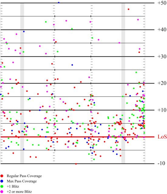
Finally, let’s look at the last breakdown for passing heat map that I will do today: passing against the blitz and passing against max coverage.  A typical pass rush is four defenders going after the QB.  This leaves seven defenders in pass coverage.  Bringing extra pass rushers can force a bad throw, but it can also leave the field open for passes due to the reduced coverage.  On the flip side, dropping extra defenders into pass coverage can leave the QB with no open targets, but the reduced pressure can give the QB and receivers enough time to find a gap in the defense.  Let’s take a look.

2013_HeatMap_Num_Pass_Defenders

Against max pass coverage, meaning at least eight defenders defending the pass (leaving three or fewer pass rushers), USC typically threw the ball short.  It was usually just a check down, which is fairly expected since most receivers will be double covered.

Now for the blitz.  Against a +1 blitz (five pass rushers, six pass defenders), USC still spread the ball around the field fairly well.  There were a number passes up either sideline but also kept it around the short middle of the field as well.  The +1 blitz is interesting because it is five pass rushers against at least five blockers in the offensive line, so it is fairly balanced still.  For the +2 or more blitz, there are at least six pass rushers, which means that either the running back and/or a TE must block or there will be a free rusher.  Against the +2 blitz, you see fewer passes to the short middle of the field, mostly because the RBs and TEs are likely tied up in blocking.  There are, however, a number of deep passes against the +2 blitz.  If the pass rush fails to get to the QB, it opens up for one-on-one situations deep since there is most likely no safety support.

Let’s look at completion percentages in these situations.  With the standard seven pass defenders, USC completed 71.4% of passes.  With max coverage, this increased to 73.2%, so Kessler can be patient and wait for his receivers to get open or to check down.  Against a +1 blitz, USC completed 60.2% of passes, so noticeably down.  Against the +2 blitz, USC was down to 53.1% completion rate.  The blitzes were fairly effective in that sense.

Conclusions

That’s all I have for now.  I did gather data for specific coverages that were used, but did not really have the time to create the diagrams for those.  Maybe I will still create them if I have time later on, but I would expect that this will be my last post before the 2014 season starts.  I look forward to see how this data changes under Coach Sark.  I hope you all found this data useful and interesting.  I also hope to see you all return for more analysis of the 2014 USC Football Season.
A Look Back at USC’s 2013 Running Game Tendencies

First, a big welcome back as Football Season approaches! I think we’re all very excited to see what the 2014 season brings with new HC Sarkisian.

I’m going to start this season with a look back at last season. I’ve been hard at work lately reviewing all the games from last season, primarily looking at the passing game. However, the passing game analysis will take place in the next post. This post is a little bit of a teaser and will do an in depth analysis of the running game.  We will analyze how USC attacked each gap, starting with a quick explanation of running gaps then breaking it down by coach and players.
A Quick Explanation of Gaps

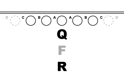
The running game is all about the gaps. The offense is trying to open up gaps while the defense is trying to plug them up. A gap is formed by the space between two offensive blockers, typically offensive linemen. There is a natural naming convention for the gaps, as can be seen below.

2013_Rushing_Gap_Diagram

The gaps are lettered starting from the center and moving outward.  The “A” gap is the space between the Center and the Offensive Guard.  The “B” gap is the space between the Offensive Guard and the Offensive Tackle.  The “C” gap is between the Offensive Tackle and the Tight End (if there is no Tight End, then the “C” gap is the perimeter from the Tackle to the sideline).  The “D” gaps are shown greyed out because they are optionally there based on if there is a Tight End in the formation or not.

Generally, the “A” and “B” gaps are interior runs while the “C” and “D” gaps are perimeter runs.

How USC Attacked Each Gap

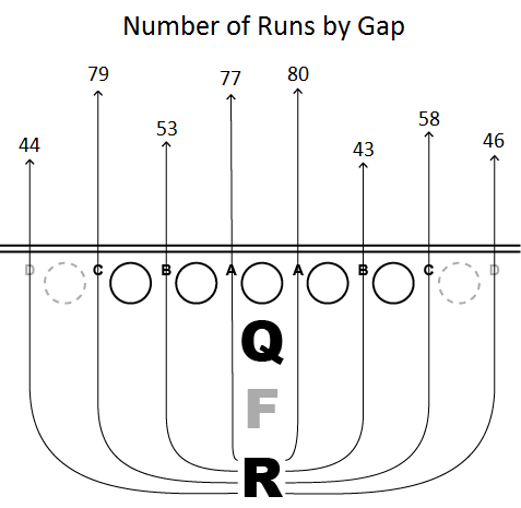
Now let’s look at the statistics of last season. Below is a diagram breaking down the number of runs through each gap last season.
2013_RunGaps_By_Gap


USC slightly favored the left side when running the ball with 53% of the run going to that side. USC also favored running to the inside rather than the outside (again with 53% of the runs going inside).

In addition to what is shown on the diagram, USC ran the ball towards the strong side of the formation on 48% of running plays and towards the weak side on 28% of running plays (with the remaining 24% having no strength side of the formation, or a balanced formation).

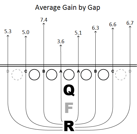
Now let us take a quick look at the average yards gained rushing through each gap.

2013_RunGaps_Gain_By_Gap

The left “B” gap averaged the highest gains.  Other than the left “B” gap, the right side of the line averaged higher gains than the left side.  The left “A” gap yielded the lowest yardage production with only 3.6 yards per carry through that gap.  Strong side runs averaged 4.9 yards per carry while weak side runs averaged 6.5 yards per carry.

How Each USC Coach Attacked Each Gap

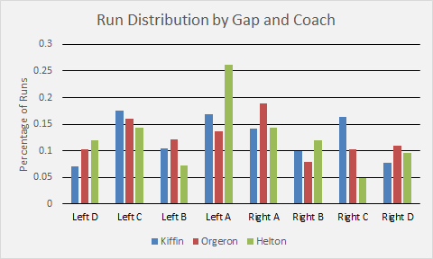
Let’s break it down by coach. We’ll use percentage of run plays to normalize against the differing number of games each coach called plays for.  [Update 8/19: It is worth explicitly pointing out that Coach Helton was the Offensive Coordinator during Coach Orgeron’s tenure, so he still had a hand in the offensive playcalling during that time.  His sample size is also small for the portion called out here as it is only for one game.]

2013_RunGaps_By_Coach


Coach Kiffin tended to favor both “C” gaps as well as the left “A” gap, but had a fairly decent balance across each gap. Coach Kiffin has the lowest percentage of “D” gap runs but the highest percentage of “C” gap runs. This could either signify that Kiffin did not prefer to run to the extreme perimeter, did not utilize the tight end formations as often as the other coaches, or ran towards the weak side of an unbalanced formation utilizing tight ends. My guess is either the first or second explanation as Kiffin ran the ball towards the weak side of the formation only 25% of the time.

Coach Orgeron was fairly balanced between left and right runs (52% to the left, 48% to the right), however when he did run to the right, it would typically go to the right “A” gap. His tendency was to run the ball to the right “A” gap or to the left side of center as we see fewer runs to the right “B”, “C”, and “D” gaps. Coach Orgeron did have the best balance between strongside and weakside of the three USC head coaches with 47% of runs going to the strong aide and 31% going to the weak side.

Coach Helton very much preferred the left “A” gap with 26% of all his runs going through this gap. He had the lowest percentage of runs going through the left “B” gap and the right “C” gap. Coach Helton was also the least balanced with 76% of his runs going to the strong side of the field and only 17% going to the weak side.

How Each USC Player Attacked Each Gap

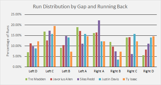
Now let’s break it down by player rather than coach. Again, these numbers are by percentage to normalize against the number of carries each player had.  The running backs are ordered from left to right in the legend based on the overall number of carries they had last season.
2013_RunGaps_By_Player

Tre Madden had the majority of his runs inside (56%) compared to outside (44%).  Most of those inside runs went through the “A” gaps.  Tre Madden had the lowest percentage of “D” gap runs of all running backs.  45% of Madden’s runs went to the strong side while 23% went to the weak side.

Javorius “Buck” Allen had a similar percentage of inside runs (54%) as Tre Madden.  However, Buck Allen generally had better balance between each gap that he attacked when compared to Madden, including better “D” gap perimeter running.  56% of Allen’s runs went to the strong side while 26% went to the weak side.

Again, Silas Redd had a similar percentage of inside runs (56%) as both Tre Madden and Buck Allen.  However, Silas Redd has an interesting distribution that isn’t quite as balanced as the others.  Redd was sent through the right “A” gap much more than the left “A” gap.  For the “B” and “C” gaps, Redd went through the left side much more often than the right side.  The “D” gaps were really the only balanced gaps for Redd.  Redd had good balance for strength of field with 48% of his runs going strong side and 32% going weak side.

Justin Davis and Ty Issac didn’t get as many carries as the other leading running backs, but it is important to see their role.  Unlike the other main running backs, both Davis and Issac were perimeter runners with 54% of Davis’s runs and 59% of Issac’s runs going to the outside.  Issac had the most “D” gap runs of all backs.  Davis was the most balanced for strength of field with 35% of runs going strong side and 30% going weak side.  This also means he had the most runs within a balanced formation.  Issac was the most unbalanced for strength of field with 56% of his runs going strong side and only 22% going weak side.

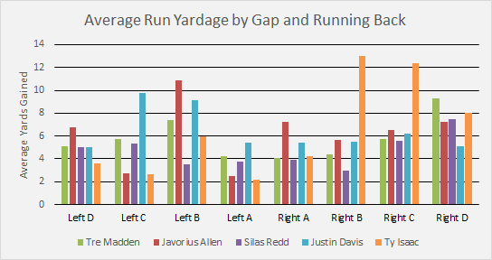
Now let’s look at the average number of yards gained by each running back based on the gap.

2013_RunGaps_By_Player_Yardage

Madden had the most success running either to the right “D” gap or running to the left “B” gap.  The right “D” gap was the one that Madden ran the fewest times to, but he averaged 9.2 yards per carry.  When running to the strong side, Madden averaged 4.4 yards per carry compared to 6.1 yards per carry going to the weak side.

Of all the running backs, Buck Allen was the most successful running out of the left “D”, left “B”, and the right “A” gaps.  Surprisingly, given his success in the right “A” gap, Allen had some of the worst production coming out of the left “A” gap.  Allen also had very poor production in the left “C” gap.  Allen averaged 6.7 yards when running to the strong side, but only 3.0 yards when running to the weak side and is the only running back who averaged more yards going to the strong side compared to the weak side.

Silas Redd was generally middle of the pack in each gap, but he struggled running the “B” gaps on either side when compared to all the other running backs.  Redd was fairly balanced in terms of strength of field with a 4.3 yards per carry average running to the strong side and a 4.6 yards per carry average running to the weak side.

Davis had much more success running to the left compared to the right.  He had strong success on the left “B” and “C” gaps and was fairly average running through the other gaps.  Surprisingly, Davis averaged only 3.4 yards per carry when running to the strong side but had a group best 12.6 yards per carry running to the weak side.

The exact opposite of Davis, Ty Issac was much more successful running to the right compared to the left.  The left “A”, “C”, and “D” gaps were group worsts with the left “B” gap being group second worst.  However, Issac had a group best by far for both the right “B” and “C” gaps.  The right “D” gap also had great success.  Like Davis, Ty Issac had a low 3.4 yards per carry running to the strong side but a high 9.8 yards per carry running to the weak side.

Coming Up Next…

This concludes my analysis of the 2013 running game.  My next post, which should come closer to this coming weekend, will take an in depth look at the passing game.  We’ll look at the passing heat map for a number of situations.  I hope that after I finish going over the data that I’ve compiled I’ll have some interesting insights to share.  I look forward to finishing that post up!

An Analysis of Coach Sarkisian’s Comparative Statistics at UW

I always like to look at “comparative statistics” to get a better gauge at how a team is doing.  This post will look at Coach Steve Sarkisian’s comparative stats over his years at Washington.  First, we will define what a comparative stat is.  Then, we will look at both offensive and defensive stat categories from year to year, starting in 2008 up until this season.

What is a Comparative Stat?

A lot of basic statistic comparison done in football is the pure numbers.  For instance, USC averaged 392.3 yards per game of total offense, or #79 in the nation.  It is a good basic measure of offensive capability.  However, it doesn’t take into account things such as strength of schedule.  Playing a bunch of bad teams will inherently boost your numbers, making your team look better than it actually is.  On defense, you can also run into a similar issue where playing a couple teams that primarily run the ball causes your pass defense numbers to look better than they actually are (since you are not “allowing” as many passing yards).

A comparative stat takes it a little bit further to normalize these types of situations.  When looking at comparative stats, you will look at how your team did compared to what the opponent typically allows.  For instance, USC gained 192 yards rushing against Hawaii.  Seems reasonable enough on the surface.  However, Hawaii’s rushing defense allows an average of 213.6 rushing yards per game.  This means that in comparative stats, USC had a -21.6 yard margin in rushing offense.  Put another way, USC did below average against Hawaii rushing the ball.  You can then average these numbers over a season and you start to get a better picture on how “good” or “bad” a team is in each category, normalized based on strength of schedule and other factors.

How we’ll look at Sark

What I wanted to do was look at the comparative stats for Washington over all of Coach Sarkisian’s tenure.  Much has been written and dissected about his win-loss record over this time period, but I wanted to see if he generally improved his numbers throughout the years or if they stayed stagnant (similar to his win-loss record).

In the sections below, we will look at a line chart which will depict the comparative stats margin for each category from the 2008 to 2013 seasons.  The reason I included 2008 was to show improvement in the transition from Willingham to Sarkisian. Each chart will have a trend line which shows the overall trend from 2008 to 2013.  I also color code each chart based on Offensive and Defensive Coordinators, so you can tell when notable coaching changes were made.

Offense

Coach Sark is an offensive coach, which is why I was most interested in his offensive comparative stats.  Before we jump in, I want to describe the color code for the offensive charts.  In all offensive charts,  the red segment shows the switch from Willingham at HC and Tim Lappano at OC in 2008 to Sark at HC and Doug Nussmeier at OC.  The blue segment from 2009 to 2011 is Doug Nussmeier’s time at OC before he started coaching at Alabama.  The green segment from 2012 to 2013 is the time period with Eric Kiesau as OC.  It is worthwhile to note the OC during Sark’s tenure, but remember that Sark was calling the plays as the head coach and ultimately had final say in the offensive gameplan.  It is also important to note that Sark completely revamped the UW offense in 2013 to feature a no-huddle spread offense, so keep an eye on how that changes their comparative stat margins.

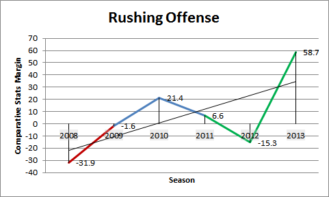
First, let’s look at rushing offense.  The first chart we’ll look at is rushing offense.

Sark_Comp_Rushing_OffenseAs can be seen here, Sark took a rushing attack that was averaging nearly 32 yards below average and brought it to about average in his first year.  The trend continued improving into 2010.  The rushing attack started to decline over the next two years and fell below average again in 2012.  However, after revamping the offense, UW’s rushing attack gains almost 60 yards more per game than the opposing defense typically allows.

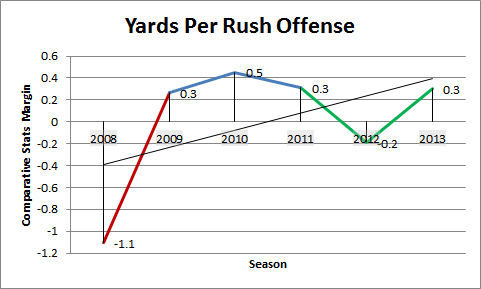
Now let’s look at yards per carry.

Sark_Comp_Rushing_YPCYards per play is an important statistic to look at when looking at no-huddle offenses.  This is because these teams typically get more offensive snaps than average, which leads to inflated yards.  The yards per carry numbers matches up pretty well with curve we saw in the rushing offense chart.

Now let’s look at passing offense.

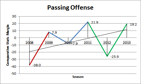
Sark_Comp_Passing_OffenseIn passing offense, a large gain was made in the first year under Sark.  The second year showed a regression, but this regression was overshadowed by the gains made in the 3rd year.  However, 2012 showed a dramatic drop in passing production as the OC coaching spot was changed.  This drop was mitigated by the change up in offense in 2013.

Now let’s look at yards per attempt, yards per completion, and completion percentage.

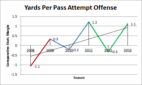
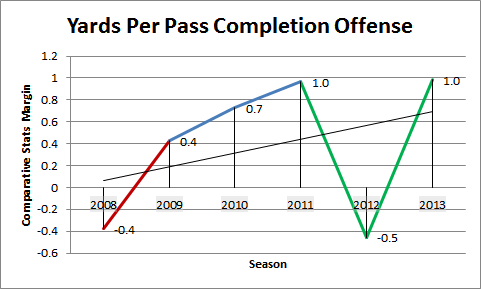
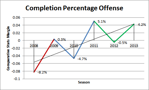
Sark_Comp_Passing_YPASark_Comp_Passing_YPCSark_Comp_Passing_CompPercAll these charts are interlinked.  The yards per completion chart is a compilation between the yards per attempt and the completion percentage charts.  One interesting thing to note is 2010, when the completion percentage dropped quite a bit and a corresponding drop in yards per attempt, but yards per completion rose.  This could mean that UW was more aggressive in their passing attack that year, attempting deeper throws and therefore completing fewer of them.

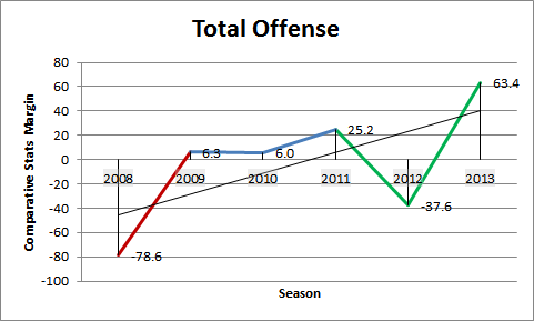
Now let us look at total offense.

Sark_Comp_Total_Offense

Total offense shows a very large jump in Sark’s first year where it generally stayed static before regressing in 2012 under new OC Kiesau.  However, 2013 showed a dramatic boost in offensive production with the installation of the new spread offense.

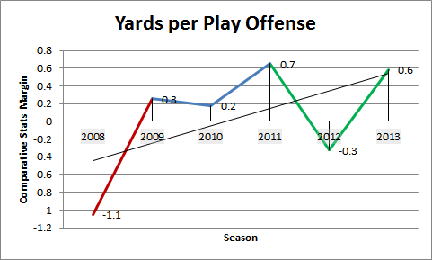
Time for yards per play on offense.

Sark_Comp_Offense_YPPYards per play shows a similar chart.  However, it is worthwhile to note here that the yards per play between 2011 and 2013 are similar, yet 2013 had many more yards per game (from the last chart).  This illustrates how a no-huddle offense will skew the numbers.

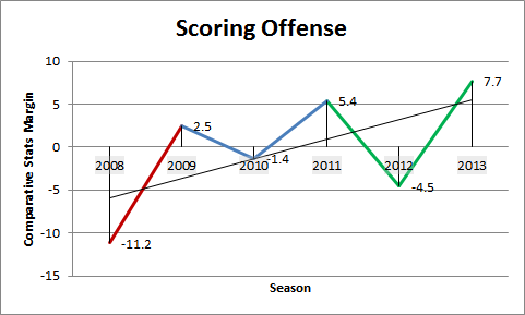
Finally, let’s look at scoring offense.

Sark_Comp_Scoring_OffenseScoring offense follows a similar peaks and valleys as the other charts.  UW’s offense was at its best in 2013, scoring almost 8 more points than the opponent typically allowed.

Defense

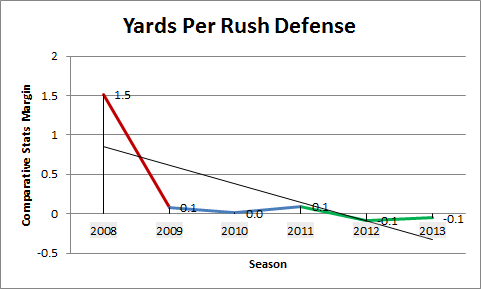
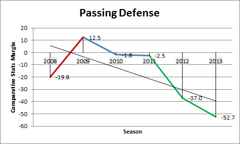
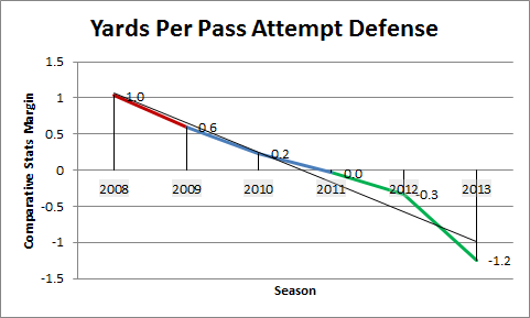
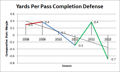
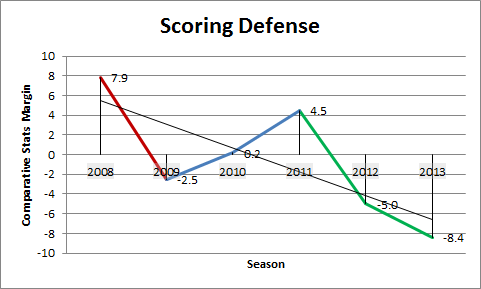
Now it is time to look at the defensive side of the ball.  In the defensive charts, the red segment shows the switch from Wililngham at HC and Ed Donatell at DC to Sark at HC and Nick Holt as DC.  The blue segment from 2009 to 2011 is the era with Nick Holt as DC.  Nick Holt was fired as DC after the 2011 season and Sark brought in Justin Wilcox, who is represented by the green segment in the 2012 to 2013 seasons.  It is important to note that for defensive comparative stats, more negative is better (meaning you are allowing less yards than your opponent is typically gaining).

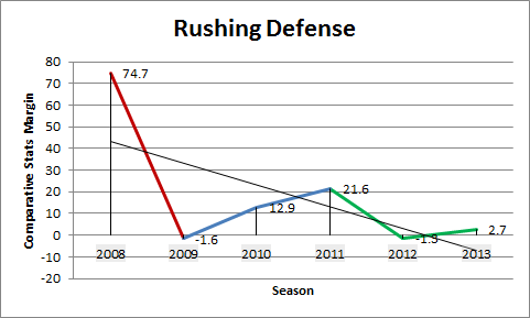
First, we’ll look at rushing defense.

Sark_Comp_Rushing_Defense

Rushing defense improved dramatically in Sark’s first year.  Still, that improvement brought UW only to about average, with only 1.6 fewer yards allowed on the ground than average.  The rushing defense progressively got worse under DC Nick Holt, and again improved once Justin Wilcox was brought in (again, only to average).  It stayed as an average rushing defense in Wilcox’s two years.

Let’s look at yards per carry defense.

Sark_Comp_Rushing_YPC_DefenseAgain, it is important to look at yards per play for 2013 with the installation of the no-huddle offense.  When you have a no-huddle offense, it means that the defense is on the field a lot longer which can inflate the yards allowed.  When looking at yards per carry defense, It has been pretty static since Sark has taken over.  UW hovered at around the same spot despite the DC change and despite the switch to the no-huddle offense.

Now let us look at passing defense.

Sark_Comp_Passing_DefenseSurprisingly, UW got worse on passing defense after their winless 2008 season.  All of the years under Nick Holt had worse passing defense than under Willingham.  However, passing defense dramatically improved under DC Justin Wilcox and continued to improve from year 1 to year 2.

Now let’s look at yards per attempt, yards per completion, and completion percentage.

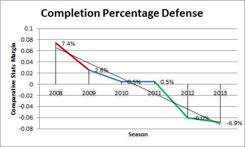
Sark_Comp_Passing_YPA_DefenseSark_Comp_Passing_YPC_DefenseSark_Comp_Passing_CompPerc_DefenseAll of these charts show a steady improvement from below average to above average.  There was spike in 2012 in yards per completion, which is notable.  This may be due to the change in style with DC Justin Wilcox.  It is notable that even though yards per completion rose in 2012, completion percentage dropped dramatically.

Now let’s look at total defense.

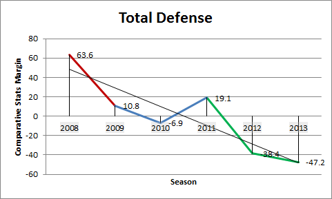
Sark_Comp_Total_DefenseTotal defense had a general downward trend as well.  2011 had a large spike, which was the year that DC Nick Holt was fired.  This spike was completely negated by Justin Wilcox coming in and further improving UW’s defensive performance.  It is somewhat surprising to see a total defense improvement in 2013 after the no-huddle offense was implemented.  Typically the total defensive yards suffer under no-huddle since the opposing offense just has more time with the ball which leads to more yards.

Now let’s look at yards per play defense.

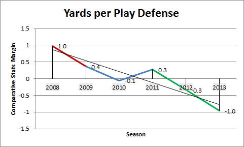
Sark_Comp_Offense_YPP_DefenseAgain, UW continued to progress throughout the years, other than 2011.  The defense continued to improve under Justin Wilcox, with UW allowing 1 yard per play less than the opposing offense typically gained in 2013.

Finally, we look at scoring defense.

Sark_Comp_Scoring_DefenseScoring defense improved in Sark’s first year, but then steadily regressed under Nick Holt.  After Nick Holt was replaced with Justin Wilcox, the defense improved vastly and continued to improve from year 1 to year 2.

Conclusions

Coach Sarkisian had a five year run at UW.  During that time, he went through two OCs and two DCs.  Also in those five years, it seemed as if Sark had hit a bit of a ceiling on his season win total.  However, looking at each statistical category, there is a general improvement in the trendline for every single category.  The main areas that UW did not improve very much after Sark was brought in was yards per rush and rushing defense.  It will definitely be interesting to see how much of these stats carry over to Sark’s tenure at USC.